

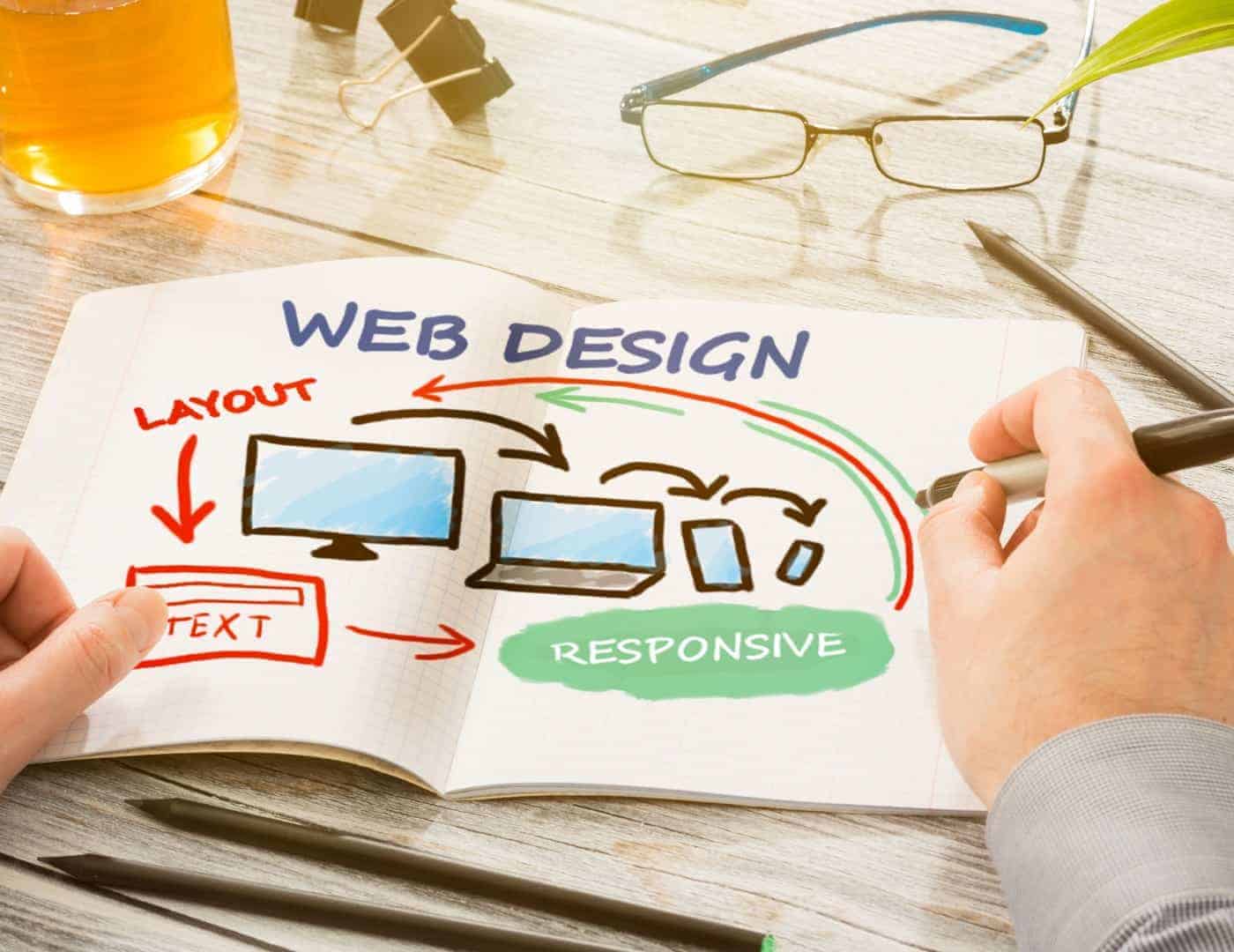
You’ve heard about responsive design and how it’s importance in SEO.
So you’ve decided to go responsive. The question is – should you convert your existing website into a responsive site or should you ask your Warrington web design agency to build a new website from scratch?
Why You Should Rebuild
Although it’s possible to make an existing website responsive, it will take almost the same time (and money) as building a new responsive website. And even after the conversion is done, the results are may be less than perfect.
Warrington Web Design can build a fully responsive 4-page website for £299 + VAT. Why stick to your old site when you can get a fresh design and the latest features at an affordable price?
If your existing website was built several years ago, chances are that every aspect of the site – the design, the layout and the coding – is outdated. So rebuilding your website is the most appropriate solution.
Warrington Web Design will build your website on the world’s most popular CMS – WordPress. Your website will be fully functional and visually appealing. Moreover, it will be optimised for SEO to enhance your visibility in the search engines.
A Mobile Friendly Site is Crucial to Better Search Engine Rankings
Wondering what a responsive design has got to do with your website’s SEO rankings?
Well, a mobile responsive design plays a crucial role in search rankings. Here’s why.
As part of its algorithm update in April 2015, Google announced that it will consider mobile friendliness as an important ranking signal when ranking websites in mobile search results.
So if you are wondering why your website isn’t showing up in Google results, that’s the reason why. If you do not make your website responsive, it’s unlikely to show up in mobile search results.
No matter how much you optimise the content and the meta data of your website, if it’s not responsive, all your efforts are in vain.
Better User Experience
A mobile responsive design is a great way to take care of your visitors. Say you are looking to buy a shirt, and you come across a website that is offering the product you’re looking for. However, the site is not mobile friendly.
Now visualise yourself squinting to read the contents of the page and having to frequently pinch the screen to zoom.
Would that be an experience to remember or would you immediately exit the page to find another website that provides a better experience?
That’s the kind of experience your visitors are going through on your website.
Warrington Web Design can build a fully responsive and a visually stunning website for you. Contact us today for more information.